You're probably wondering: is it really time to update your industrial manufacturing website or build a new one?
Whether you’re the person going to bat for a new site or making the call move forward, the task can be a headache.
There’s no getting around it: website projects are a significant investment of time and money, and you don’t have an infinite amount of either.
You may even see your website as an obligatory resource drain with no clear idea of how it’s affecting your bottom line.
And, while it’s true that websites can cost a lot of money without generating much return, it doesn’t have to be this way.
In fact, the best manufacturing websites not only generate leads for you, but lighten the load of your sales and customer service teams.
How?
Well, let’s consider the way many B2B customers select vendors today.
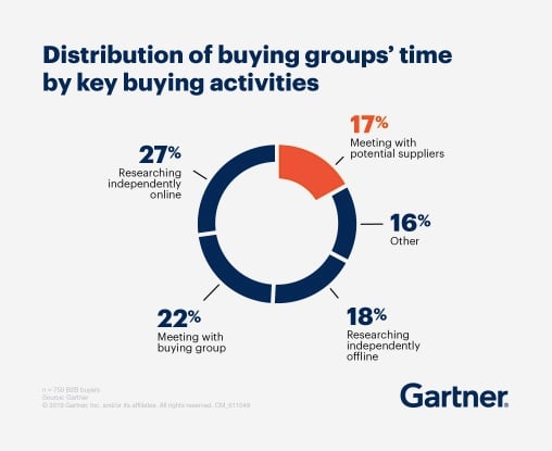
Source: Gartner
According to research by Gartner, "when B2B buyers are considering a purchase, they spend only 17% of that time meeting with potential suppliers," and spend a significant amount of the remaining time "researching independently online."
Many B2B websites offer:
- Answers to common questions faced by buyers researching their problems
- Resources that appear in search results and help potential customers determine whether the vendor’s a good fit
- Form-gated lead generation offers that address the challenges and opportunities faced by prospects in each phase of the buyer's journey
A site like this serves as a 24x7 resource that helps potential customers qualify themselves and demonstrate why you have an effective solution to their needs.
While the manufacturing industry is traditionally less digital in its marketing than other B2B verticals, the pandemic has prompted companies to invest more in digital avenues both at an operational level and in marketing.
Consider:
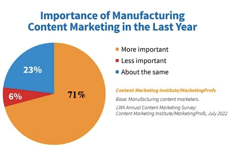 Source: CMI
- 71% of manufacturing marketers surveyed by the Content Marketing Institute said the importance of content marketing increased for their company over the last 12 months.
Of those surveyed, the most popular content types in use were videos and short posts/articles. These were also the top two categories for generating results out of the content marketing methods they tried that year.
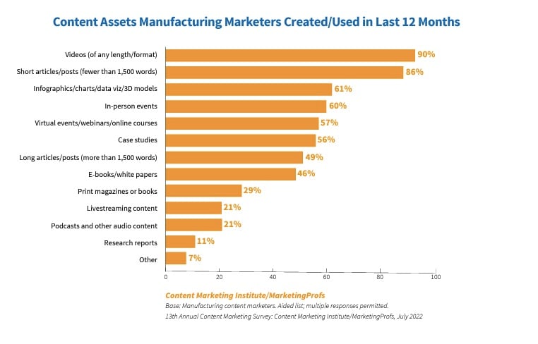 Source: CMI
- 90% of participants said they created video content and 57% said it produced the best results, while 86% published “short articles/posts” and 31% said they produced the best results.
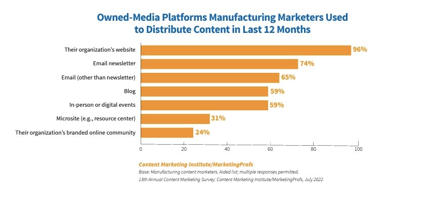 Source: CMI
- As for where this content was being published, overwhelmingly, participants said they posted it on the company website (96%) or distributed it via e-newsletter (74%).
At the same time, savvy companies are serving prospects online in a more direct way: by providing a great experience using their sites.
A Thomasnet industrial buying habits survey found that 73% of buyers “pa[id] attention to manufacturing websites” and one participant even made the point of telling researchers “If I struggle to navigate a website you have about 30 seconds of my time and then I am gone.”
The bottom line here is that while not every manufacturer is investing in (and benefiting from) website investments, many are.
So how many opportunities are you losing because your website isn’t what customers and prospective owners want (and increasingly expect) it to be?
The basic ingredients of a great manufacturing website
Putting together a quality website combines a lot of specialized skills like copywriting, web design, and web development.
Here, I’ve tried to cut out some of the jargon and focus on the high-level takeaways. In a nutshell, here’s what your site needs to attract and serve customers and prospects.
The right stuff under the hood
Hiring an experienced developer with a good track record may cost more up front, but it's less risky. Cheaper developers cut corners, resulting in a site with functional and performance limitations that frustrate you and bugs that frustrate visitors—working against lead generation goals.
Here’s what you can expect from a competent site developer:
- A site built to the design specifications provided by your web designer
- Pages that respond elegantly to fit all screen widths and devices
- A site built with pages and modules that are easy to edit, even for non-coders
- Pages that load quickly without excessively large media and script loads
- A comprehensive QA process that eliminates functionality bugs and broken links
A content management system (CMS) is a platform that allows you to access, edit, and manage your site pages, like Wordpress or HubSpot.
Healthy sites add, edit, and remove pages all the time, so investing in a CMS you can work with yourself rather than calling your developer every time you notice a typo can save you a world of grief.
Choosing a good web host (the company that stores your website) is also critical if you want to generate leads on your site, because:
- A poor host may not offer the security features of a better host. Poor site security can scare away potential customers afraid of having their data stolen.
- Your site may load more slowly. If a page takes longer than three seconds to load, many visitors will leave.
- Your site may go down more often than you’d like, leaving you periodically dead in the water. This can result in lost opportunities.
- A poor host will not offer the same level of customer support when you need it. When your site does go down, you want to minimize its downtime. Better support helps you do that.
Additionally, slow page speeds and poor security can hurt your search visibility, which makes it harder to do search engine optimization.
Elegant architecture: an intuitive website layout
Visitors expect to quickly find what they need on a site, so deciding how to organize your pages is key.
“Site navigation” refers to the menus that help your visitors move around the site, such as the menu bar at the top or side of your site, links in the footer, and “breadcrumbs” that map your current location.
Here are a few tips for creating an effortlessly navigable site:

Source: Madison Banders
Follow conventions. There are standard places to put certain navigation items. The contact or demo request button is usually in the furthest right position on your menu, and the home button is usually in the furthest left corner, or middle.
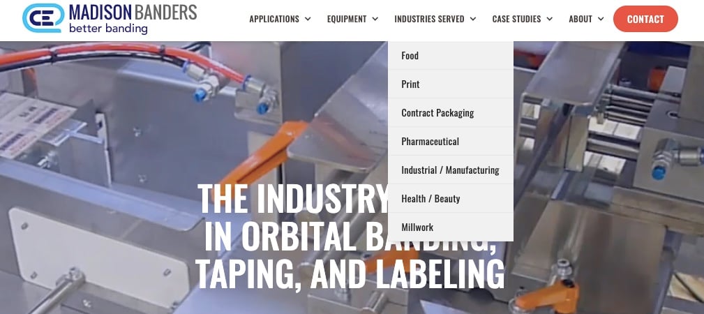
Limit your menu to the 7 most important items or fewer to avoid overwhelming visitors. List child pages beneath them or in links at the bottom of your site.

Source: Dustless Blasting
Use clear labels. Give menu items short, descriptive names.

Source: Cree lighting
Use breadcrumbs. If you have many pages below your main pages, it's helpful to provide a map that shows visitors where they are in relation to other pages.
HubSpot wrote a great guide to laying out your site intuitively.
Persuasive copy and content writing
Copywriting is writing to sell—for example, creating web pages and ads.
Content writing is writing to provide value to the consumer, with a secondary goal of moving that consumer closer to making a purchase.
For most websites, both are essential for attracting and converting leads.
Tips for writing excellent copy and content alike:
- Be empathetic—address and demonstrate understanding of the problems and symptoms that brought your audience to your content
- Highlight opportunities—bring your audience’s attention to opportunities for improving their situation
- Tailor—tailor your message to your target audience by speaking their language, acknowledging their feelings, addressing their challenges, and acknowledging where they are in their buyer’s journey
- Be clear—write prose that’s easy to read, free of jargon, concise, and error-free
- Delightful—provide the audience with additional resources, offers, and other helpful gestures to foster goodwill
- Optimize for search engines—write for people first, but also make it easy for search engines to crawl pages and generate relevant results
- Tell stories—humans have always loved stories. Use narratives like case studies or relevant anecdotes to appeal to your audience
- Be original—present a fresh take and/or new/better information about your topic
- Relevant—ensure what you write is directly relevant to your target audience
- Useful—provide your audience with the information they are already looking for
- Fresh—publish new content and frequently update the old to ensure everything is accurate
- Authoritative—write about topics that align with your company’s areas of expertise; try to find a person with deep firsthand knowledge about your topic to write about it or provide information for the content
Extra copywriting tips:
- Tell the truth—sell the visitor on the best qualities of the product or service you’re advertising
- Persuade—compel the visitor take action, like filling out a demo request
- Inform—give visitors the information they need to make an informed purchasing decision
- Be creative—grab and hold readers’ attention with the unexpected
Clean, on-brand design
The design of a website pulls a lot more weight than most people realize. It needs to be more than pretty or functional—it should be both.
Your design helps determine whether site visitors leave within the first second of arriving.
More obviously, your site telegraphs who your brand is: your logo, the colors you want customers to associate with your products and services, your values, and your “personality,” which ideally is someone your customers enjoy interacting with.
Your site also actively helps you convert visitors into leads by:
- Drawing readers attention to focus on completing a specific action
- Effectively using color, white space, and other design tricks to draw the eye where you want to it go and evoke the appropriate emotional responses
- Creating designs that are easy to interact with on any device
- Using headings and fonts to make copy easier to read
- Breaking up copy with different module styles and visuals to keep readers from feeling maxed out
- Designing with quick page load speed in mind
- Making design choices that make the page accessible for everyone, such as using contrasting and significantly large fonts
Example: TLX Technologies
This product page uses a number of the techniques described above, such as:
- Using orange only for the CTAs to draw users’ eyes—and therefore attention—on taking the next action
- Making ample use of white space to avoid overwhelming the reader
- Using headings and design elements to break up text
Learn more about great manufacturing website design (with examples) →
Conclusion
A good manufacturing website functions as a virtual storefront—serving customers even when you’re out of the office and helping you generate leads.
Read our case study to see how we helped three clients get results, starting with a website overhaul.
Topics: Website Optimization, manufacturing


