In 2023, when 35% of consumers rely on the internet to find a local business multiple times a week, and visitors judge your site based on aesthetics in just .05 seconds, it’s critical that franchises have a high-functioning website that attracts and engages visitors.
Here, we’ll:
- Explore essential practices to help your franchise website hook visitors on the first page they visit.
- Explain how to ensure a convenient user experience and use SEO best practices to reach more potential customers.
- Discuss what to look for in a vendor if you need a partner to help you.
Best practices for franchise website design
Design your mobile site first
 Mobile franchise website; Source: Restaurant Heroes
In 2023, it’s wise to design your mobile site first, then scale up to the tablet and desktop views.
 Desktop version of the same site
This approach is smart for a couple reasons:
1. It reflects Google’s shift to mobile-first indexing.
Over the past few years, Google has begun switching from indexing the desktop versions of websites to their mobile versions as smartphones replace desktops as the preferred device for web browsing.
If you’re not familiar with Search Engine Optimization (SEO), here’s the quick explainer.
Google, the dominant search engine in the world, indexes and ranks websites using bots that “crawl” websites in order to catalog the content and organization of their pages.
When someone performs a Google search, Google refers to its catalog of web pages and uses an algorithm to rank what it determines as the best, most useful information to answer the searcher’s question (search query).
Then, it provides a list of search results ranked from most useful to least useful (plus a few ads).
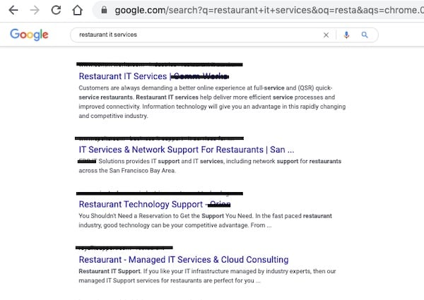 Source: Google
As a business on the web, you want your franchise to rank as high as possible on those search results for queries relevant to your business. Ranking high in search results helps potential customers find you.
Many of Google’s ranking factors are aimed at providing searchers with a better search experience.
Mobile devices account for more than half of web traffic in the world, and as of 2018, about half of “B2B inquiries were made on smartphones.”
It pays to provide a design that looks great on any device.
2. It follows the tenet of “progressive enhancement.”
This is a fancy term that means the hardest design (mobile) should be done first.
Smaller screen sizes require designs to only retain the most essential features. Starting with those features and working your way up to larger screen sizes ensures you’ve nailed the most important elements.
This approach is the opposite of what’s been termed “graceful degradation,” which is the traditional approach to web design.
This is when you start with all the complexities of a larger desktop site and try to strip it down for mobile devices. Those critical features can become meshed with the less important elements, making it difficult to separate them in the mobile design.
The end result is a mobile site that looks and functions like a “cut down” version of the desktop site rather than a truly mobile-friendly experience.
Follow your franchise’s brand guide
When designing a corporate franchise website or local franchisee site, don’t stray from your brand guide. If your business doesn’t have a brand guide, start here.
Following one brand guide for all print and web content ensures your brand identity remains stable and consistent across channels.
Deviating from it could potentially distort your brand identity and confuse or disappoint your customers, since they expect to get a consistent experience from a single franchise.
A good brand guide will do much of the decision-making for you when it comes to what your designs should and shouldn’t include—right down to the nitty gritty details.
Balance Beauty with User Experience (UX)
High-functioning franchise websites prioritize usability in their design while maintaining aesthetic appeal.
In other words, they employ UX design. For those who aren’t familiar, UX design focuses on designing products (including websites) that provide a great user experience.
This often goes hand in hand with data-driven design, which uses data gathered from user interaction with websites to inform design decisions.
To provide a great user experience in 2023, corporate franchise websites should employ a clean design with clear site navigation, clear and concise copy, and abundant visual media, such as images, videos, and illustrations.
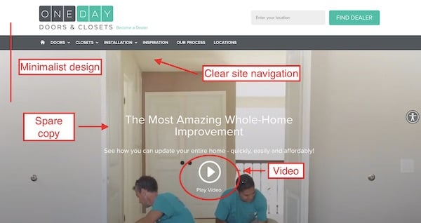 Source: One Day Doors and Closets
Clean design
A more minimalist approach eliminates competing design elements in order to help a potential customer find what they need and zero in on your offers, potentially leading to more conversions.
A Google study revealed that participants were more also more likely to perceive a website as beautiful if it was simple and matched their idea of what a website for that industry should look like.
Clear, easy to understand site navigation
Like clean design, clear navigation is key to a great user experience. It meets users’ expectations and helps them find what they need. Some examples include:
- Providing a search function and location finder
- Creating short, logical labels for pages in a navigation bar
- Putting navigation in places where users expect it, such as at the top of the page or in a sidebar
- Making icons and CTA buttons large
- Ensuring that everything clickable looks clickable. For example, if text is underlined, the user will assume it’s clickable based on past experience.
- Using contrasting, easy to read colors for copy text. If the text blends in the background, the user may struggle to read it.
Clear and concise copy
Using headlines, subheadlines, and concise paragraphs makes web copy easier to read for all users.
Paragraphs longer than five lines, as well as difficult words and long sentences, are best left in print.
Web users are more likely to skim than read, since they want information fast.
Visuals
Adding useful photos, videos, illustrations, icons, and other visual elements engage readers, convey information quickly, and can potentially improve your SEO because they improve user experience.
For franchises, this might include images of your locations, products, and work, videos of your team providing a service (as in the example above), or before and after photos.
Any high-quality, web optimized image that conveys valuable information to your visitor will be an asset.
House your franchise location pages within the corporate website
Franchises usually handle each of their location-specific pages or sites in one of four ways:
- Single pages on their corporate site that list each location
- Separate pages on the corporate website for each location
- Separate websites for each location
- Subfolders on the corporate website that contain multiple pages for each location
We recommend the last option: creating subfolders (sections of your corporate website) that house franchise location pages.
This approach enables you to maintain corporate quality control over each franchise location’s contact information and ensure your brand identity is consistently conveyed.
It also enables you to create multiple pages with location-specific content that can rank for local search keywords, which is great for your website’s local search engine optimization.
Great local SEO means that potential customers living near each franchise location have more opportunities to encounter your business online.
If you are unfamiliar with subfolders (also called subdirectories), they are essentially a subsection of a website. They are used to gather related pages into the same place on the website, similar to how a folder on your computer contains related documents.
URLs contain the location of each web page. A webpage’s path (the part of the URL after the name of your website), contains all sorts of location details, including every subfolder you must open in order to get to a specific page.
For example, let’s say you visit a1concrete.com (the domain of a concrete leveling company), and land on their homepage.
In the URL, you can see only their domain name, or the name of the website (a1concrete.com).
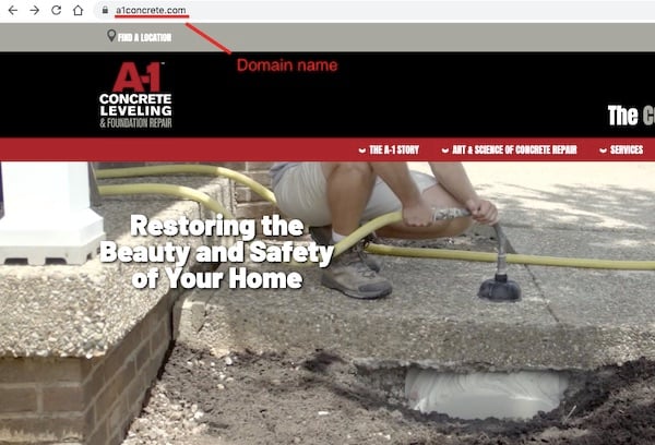 Source: A-1 Concrete
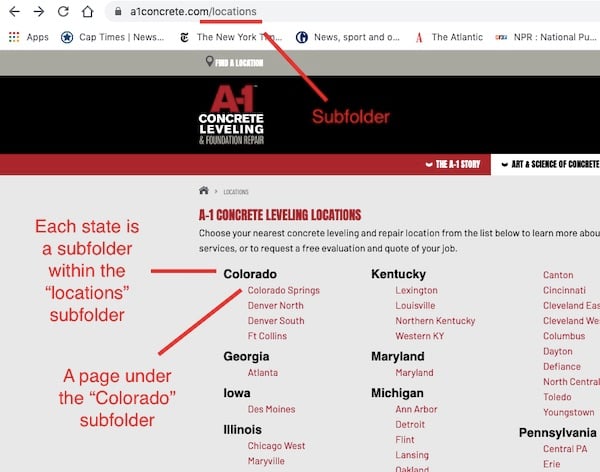
If you look at the main navigation bar, there are several topics with drop-down menus. Each drop-down menu represents a subfolder, and each item on the list is a page within that folder.
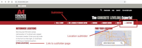
If you click the link to the subfolder page, you will be able to see all the pages listed under that subfolder. Another way to think of subfolders are pages that lead to other pages, or pages within pages.
 Source: A-1 Concrete
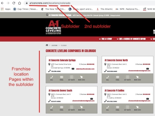
If we go to “a1concrete.com/locations/colorado we will be taken to its page.
 Source: A-1 Concrete
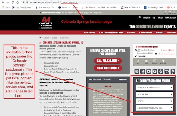
“Colorado” as it turns out, is a subfolder under the “locations” subfolder. Finally, if we click on the “Colorado Springs” box, we get a specific franchise location page.
Source: A-1 Concrete
This location page is almost like a mini website (without the pitfalls of franchisee websites) because it acts like a homepage for the Colorado Springs location.
It is also a subfolder, and contains another menu which displays further, location-specific pages we can visit with more information.
In this way, you can use pages within pages—subfolders—to organize all of your franchise locations within the corporate website, and reap the local SEO benefits of multiple, location-specific pages.
Include a franchise locator and map
A franchise locator is a must-have item for every franchise website. It helps visitors interested in purchasing your services find a location near them, making it easier from them to go from visitors to customers.

Locator in site navigation; Source: Mr. Electric
This is a painless way to help your customers find contact information, local deals, and more, which can potentially save both you and your customers time and money by eliminating the need for simple customer service conversations.
It can also help prevent frustration from extended internet searches or phone conversations that could discourage a potential customer from doing business with you.
When a customer uses the locator, this also counts as a conversion action (an action a potential customer takes to become a customer). Your marketing team can track these conversions and use that data for future marketing efforts.
Include links to your profiles on social media and review sites
Provide links on your website to any social media accounts and listings you have on review sites. One common way is to place their icons in your site’s footer and embed links.

Links to social media accounts in site footer; Source: Mosquito Joe’s
You can also provide links to your franchisee’s social media and review listings on their location pages.
 Source: A-1 Concrete
Providing links to listings is important for a couple of reasons.
- First, it’s a great way to build the reputation of your website. Linking your Google Business Profile to your site can help increase your site’s authority. This, in turn, could help you get found in search results by more potential customers.
- Second, it makes it easy for potential customers to check out your reviews, or leave a review after doing business with you. Almost all consumers use reviews to learn about local businesses, and receiving reviews is critical for each of your location’s search rankings. This means that getting reviews is important for attracting business.
Provide social proof
In general, consumers are more likely to purchase something they know others have purchased (and enjoyed) before them. According to Brightlocal's annual survey, "46% of consumers feel that online business reviews are as trustworthy as personal recommendations from friends or family."
This is why social proof is a must-have for any franchise website. For those who are unfamiliar, social proof is feedback from customers, authorities, and the public, such as reviews, ratings, testimonials, accreditations, awards, and client logos.
You have many options for incorporating social proof into your website. Here are some examples.
Display client logos, awards, and/or accreditations on your homepage
 Client logos on our homepage; Source: Madison Marketing Group
Homepages are a great place for B2B franchises to display various kinds of social proof, from client seals, to star ratings, to awards, since a homepage may form a potential customer or client’s first impression of your franchise.
 Industry affiliations and achievements on a homepage; Source: The Grounds Guys
Create a testimonial page
 Video testimonials on a home page; Source: Healthy You Vending
Testimonial pages are a common feature of business websites that reassure potential customers that they will have good experience.
Video testimonials on other pages on your website, such as your homepage or “why us?” page, are also a great way to present in-depth, positive feedback from happy customers in an engaging format.
Display stats and counters
 Source: Healthy You Vending
Statistics about your clients and franchisees can be a great way to establish credibility with potential customers and tap into potential franchisees’ fear of missing out on a great business opportunity.
You can also embed real-time counters for this purpose that measure, for example, how many customers you’ve served. These can be particularly useful on a landing page, such as below a form to show how many people have submitted it before.
Use forms
Forms are an easy, user-friendly way to collect the contact information of prospective customers and franchisees.
As a result, make sure your site has the infrastructure to both embed forms and send that data to a customer management system (CMS) like HubSpot.
Every time someone submits a form, this counts as a conversion, or “next action” that can be tracked and measured by your corporate marketing team.
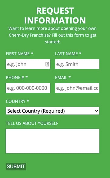 A form in the sidebar of a franchisee recruiting page; Source: Chem-dry
Forms are great for “contact us” and other landing pages, and to “gate” premium content like eGuides and case studies so they can only be accessed by submitting the form.
Design to convert
Great business websites share the same goal: get the visitor to take a next action. This could be submitting a form, clicking a call to action button, searching for a franchise location, or reading another blog post.
How you achieve this goal is partly a result of design and writing working together to lead the reader’s eyes and thoughts toward the call to action on the page.
A simple litmus test for this is to look at a page and ask yourself: Does the design lead the reader’s eye toward the call to action?
Examples of this include:
Eliminating distractions on a landing page: In the example below, all site navigation has been removed so the visitor can focus on the form.
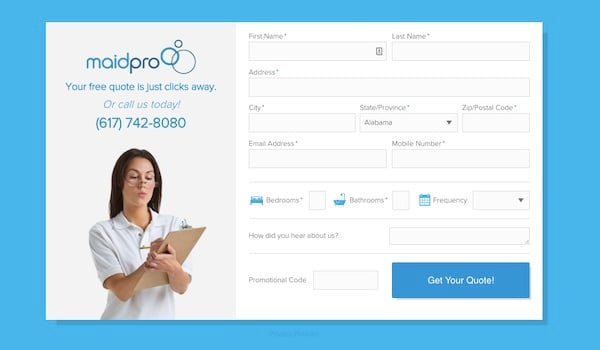 Free estimate form; Source: MaidPro
Making the CTA button a contrasting color: Making the CTA stand out from the rest of the page draws the reader’s attention better than a more subtle color.
Of course, there’s such a thing as too forceful a contrast. The idea is to catch the reader’s attention without hurting their eyes. In the example below, orange is both striking and one of the company colors.
 Source: Restoration 1
Putting the CTA above the fold: You’ve probably heard of the “fold” in web design, the visual cut-off point of a web page. You must scroll in order to see below the fold.
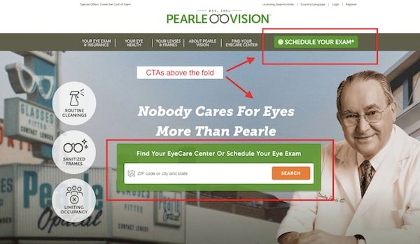 Source: Pearle Vision
Some people may leave a web page before scrolling below the fold, so it’s important to place key elements like CTAs above the fold so you can grab a reader’s attention right away.
However, there are some cases where you might want to put the CTA below the fold, such as when your offer is complicated enough that your visitor needs time to read through the information you provide and consider it.
You might think of a web page like a newspaper article written in the inverted pyramid style: provide the most important information first, followed by more and more details.
What to look for in a design vendor
If you don’t have time or tools to build a corporate franchise website in addition to your other projects, then you may want to look for a partner who can assist you.
Naturally, you want to choose an agency that provides the highest quality at the most reasonable price.
Questions to ask a potential partner
Do you write copy, design, and develop in-house, or is it outsourced?
Agencies sometimes cut corners by outsourcing work to partners in order to charge a lower price. Unfortunately, this often results in a lower-quality website.
Can you provide references for your copywriting, design and development work?
In addition to reading reviews on social media sites like Facebook and dedicated review platforms like Google Business Profile, it’s a good idea to ask for detailed references from past clients. A quality agency should have glowing client testimonials to share.
Can you provide case studies demonstrating quantifiable results achieved for businesses like ours?
Ensure the agency you hire has experience working on franchise websites. Agencies may specialize in particular markets, or serve several. You want to partner with someone who understands your needs.
What is your strategy for generating leads?
A good agency will not offer you a magic bullet. Instead, they will ask about your goals, assess your current needs, then suggest a strategy for satisfying those requirements.
What certifications and accreditations do you have?
A reputable agency will be accredited by major organizations in its industry. Its employees will also be certified in various applications and strategies such as inbound marketing or Google Analytics.
Do you partner with any other organizations?
Some agencies partner with other organizations in the industry, such as HubSpot.
Questions to answer about a potential partner
Are they willing to train me to eventually take over marketing tasks?
A good agency will not make you completely dependent on their services. Instead, they should train you to take over your own marketing tasks.
Are they honest and clear about their intentions?
A good agency will communicate clearly about their strategy, pricing, and the time it will take to gather leads. They will also not have a conflict of interest, such as working for a competitor.
Do they tailor their pitch to suit my business?
Does this agency offer personalized strategy suited to your needs and budget, or more of a one-size-fits all approach that does not take your individual needs and goals into consideration?
How well do they market themselves?
A good agency is able to produce results for themselves as well as their clients. Examine how they market themselves. If you need help building a website, how good is their website?
Asking the right questions and researching potential partners can help filter out low-quality, inexperienced, or ineffective agencies that may not give you a good return on your investment.
If you follow these website design best practices, you’ll be off to a good start in giving your franchise website a new look, improving user experience, and generating more leads for your business.


