Websites come in all shapes and sizes, but when it comes to generating quality leads online, optimized franchise landing pages are absolutely essential.
If you’re not familiar with landing pages, these are simply the website pages where your visitors can submit their information in exchange for something. That something could be a whitepaper, demo, or promise that you'll contact them directly.
If you’re intent on building a website designed to attract and convert the serious buyers out there, it’s crucial to make sure you’re leading interested visitors to landing pages they can use to take the next step.
Many of your visitors will fall into one of two categories: 1) customers, and 2) potential franchisees. You want to consider the needs of each. However, the following best practices apply whether your goal is to attract customers or recruit franchisees.
While landing pages might seem simple enough to set up, even the smallest changes in content and appearance can make the difference between gaining and losing a lead. Luckily, fixing and optimizing your landing pages might only involve a few tweaks, and the effect can be dramatic.
.jpg?width=600&name=5efa46fda04aded0e59eba8c_5e74d918761cf7df98c13feb_Lawn%20Care%20Services%20By%20TruGreen%20(3).jpg)
Source: Tru Green
Landing Page 101
What separates effective franchise landing pages from ones that perform poorly? Clean, consistent design and compelling, concise copy that's relevant to your visitor can make all the difference.
First, be sure that each landing page is relevant to the content or ad your visitor viewed before clicking the call to action.
For example, say a visitor reads a professional cleaner's ad for a new customer discount and clicks on a "schedule an appointment" call-to-action. They might be disappointed if they landed on a page that offered a "free stain removal guide."
Keep your design simple, your call-to-action buttons obvious, and your copy brief. Provide visitors with an attention-getting headline. Particularly if your landing page is long, you may want to include your call to action more than once.
Great landing pages also provide a consistent experience for the site visitor, from the time they click on your call to action to their arrival on the landing page.
Be sure to provide copy with a consistent message, and use a design for the landing page that is consistent with the style of the page that advertised the offer.
For example, let's say a visitor visits Pizza Hut's home page and sees this ad:
 Source: Pizza Hut
The visitor clicks on the ad, and is taken to this landing page:
.jpg?width=600&name=5e74df48ab3378ea6b4ea9e1_Pizza%20Hut%20%20Pizza%20Delivery%20%20%20Pizza%20Carryout%20%20%20Coupons%20%20%20Wings%20%20%20More%20(1).jpg) Source: Pizza Hut
Source: Pizza Hut
This page not only echoes the messaging from the ad ("earn free pizza" and save money) but provides a visually consistent experience by repeating design elements such as the stars, colors, pizza slices, and "hut rewards" design.
Consistent design and concise copy working together to nudge your visitor into taking a next action are the essential ingredients of a good landing page. However, there are other elements you can add (or remove) to make your landing page even more effective.
Here are five franchise landing page design tips you can use to start converting more traffic on your franchise website today:
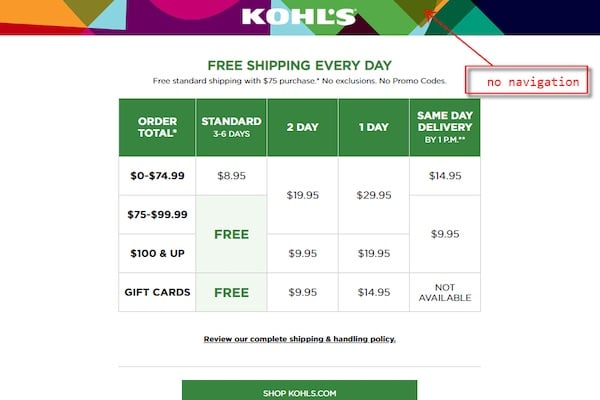
1. Remove site navigation tools
Simply put, landing pages aren’t like other pages on your website.
Unlike an “About Us” page or blog, for instance, landing pages aren’t designed to inform or educate. They’re completely focused on conversion.
Removing the navigation options from the page focuses the visitor’s attention on the task at hand—the offer and the form.
 Source: Kohl's
Whether it’s a form that grants them exclusive access to another piece of content or provides a contact team member, your website should focus primarily on driving visitors to these lead conversion pages.
Using CTAs is a great way to get a visitor to a landing page on your site.
Once they’re there, don’t give them any excuse to leave without getting what they came for.
If you’re just getting started improving your franchise’s web content, you may not have exclusive items to offer at the moment. That’s just fine.
You can (and should) set up a landing page with a contact form for those who want to get started by reaching out directly.
2. Describe the benefits of what they’re about to receive
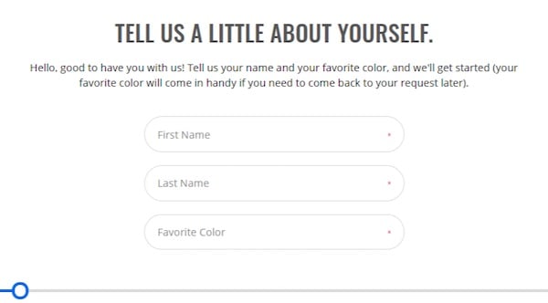
When it comes to describing the benefits of what a visitor will receive if they submit the form on your landing page, it's important to be honest and frame the information in terms of the visitor. Show them what they'll gain by submitting the form.
.jpg?width=600&name=5e6bd628a1dd825a03d4f163_vomFASS%20USA%20MASTER%20LIST%20(1).jpg)
Source: Vom Fass USA
If you're starting with a simple contact page, it's best to mention what they can expect after they submit the form.
Something as simple as: "Fill out the form below to get in touch about opening your own franchise. We'll give you a call within one business day."
This gives interested visitors a reason for why they should fill out the form (if they're interested in opening a franchise) and an expectation of what to expect (someone will call them within one business day).
If you're creating a landing page with a more substantial offer, the same recommendations apply.
You'll also want to focus on keeping your landing page succinct and to the point.
Make use of white space, headers, bullets, and stylized text to clearly communicate what a visitor will gain by submitting the form. You want them to be able to make a decision pretty quickly about whether the offer is for them.
3. Keep the form a manageable length
One of the biggest mistakes franchises often make on landing pages (and more specifically the form itself), are too many or too few data fields.
While there’s no magic number, the optimal form length depends on a few things.
- Are you attracting too many unqualified leads?
- What stage of the franchise sales funnel is that particular landing page targeting?
- Is the content or offer you’re presenting highly valuable to serious buyers?
As a general rule of thumb, if you’re simply not generating enough leads, shorten your form to only include basic contact information most visitors feel comfortable giving up.
Name, email, phone number is sometimes the only contact information people are willing to present at the first point of contact.
 Source: Two Men and a Truck
If lead volume is high, but too many tire kickers are showing up in your contact list, you might have the opposite problem on your hands.
In this case, your form is probably too simple and adding more fields to gather more detailed information is completely appropriate.
In addition to having more information in front of you when reaching out to new leads, longer forms typically weed out the people who are simply downloading content without any intent or ability to actually buy a franchise from you.
The bottom line here is pretty simple, but the message is important: different landing pages carry different goals.
Depending on where a lead is in the funnel and what it takes to attract your buyers, trial and error testing is almost always the best way to optimize your franchise's landing pages to appeal to those who are serious about moving forward with a franchise opportunity.
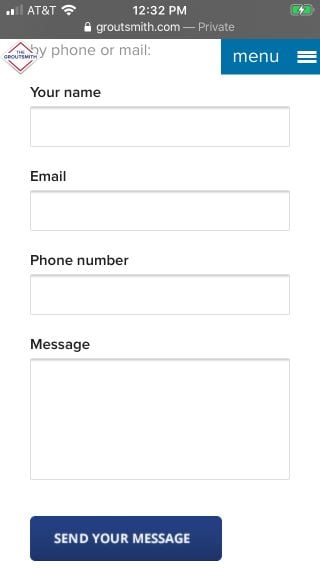
4. Make your landing pages and forms mobile friendly
Another glaring problem for franchise websites is unresponsive design.
If you’ve ignored advice to make your website mobile-friendly in the past thinking it’s simply not important, think again.
Google has moved to a mobile-first ranking system, meaning they judge the usability of a mobile view of your site as a ranking factor over a desktop view.

Source: The Groutsmith
With this in mind, it’s important to make sure your landing pages are able to conform to any size screen your visitors may be using.
Doing so ensures a consistent experience for those who may find your opportunity on one device, then switch to another to learn more and convert somewhere on your website.
5. Use social proof
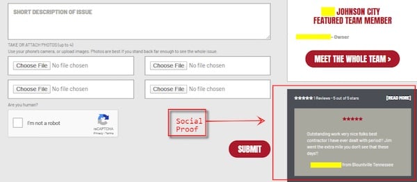
In general, if several other people had a good experience with a franchise, potential customers are more likely to trust that business (and buy from them). One way that customers gauge your franchise's track record is through social proof.
If you're unfamiliar with social proof, it's documented feedback your franchise receives from the public, such as customer reviews, testimonies, ratings, social media posts, case studies, and awards.
Social proof is evidence to potential customers and franchisees that your business is first-rate and legitimate.

Source: A1 Concrete
Including social proof on your franchise landing pages is a great way to reassure a potential client that filling out your form is worth it. You can show off social proof on a landing page by displaying
- A quote from a satisfied customer (like in the above example)
- A counter (such as how many customers you've served)
- Trust seals (such as the BBB accredited business seal)
- Awards you've received
- Client logos
- Ratings
If you include customer reviews, your visitor may also find it helpful to see a photo of the real customer. Similarly, if you're asking a lead to fill out a form, include a privacy policy so they know what you'll do with their information.
These sorts of gestures can help put potential customers and franchisees at ease.
Looking for more ways to get your franchise website found online? Check out our guide to franchise SEO.
Topics: Franchise Marketing, Website Optimization


